Introduction
Quantitative measurements are essential in all sciences, including computer science, as we can’t optimise what we can’t measure.
In this context the term “metric” and “measure” will be often used as synonymous, even if by definition metrics are functions, while measurements are the numbers obtained by the application of metrics.
Software metrics are used to record events taking place in the execution of a software program in order to obtain objective, reproducible and quantifiable measurements. These measures provide an audit trail that have numerous valuable applications, including understanding the activity, quality assurance testing, software debugging, software performance optimisation, cost estimation, budget planning, etc.
Measure Everything
In modern distributed environments a production system is usually composed of multiple applications and multiple instances of the same application. In order to be able to get the “whole picture” while retaining the ability to dig down to the most minute detail, the best approach is to measure everything!
In contrast with Software Logs that have a high I/O impact and need to be parsed to extract relevant information, Software Metrics are “light” and can be used to quickly and directly count when an event occurs, or store an arbitrary numeric value.
This is an important distinction, as it allows the collection of a lot of information that can be summarised and visualised as a graph in almost-real-time while using little network I/O and little disk space.
UDP Packets
In order to keep the measuring process efficient and inexpensive, each measure can be transmitted to the Metrics Server via the network using UDP packets. This is known as fire-and-forget approach, as either the server gets the data or it doesn’t.
The fire-and-forget approach is important also to keep the application and the Metrics server decoupled. The application doesn’t care if the server is up or down, and works regardless. So the Metrics Server status doesn’t influence the application behaviour.
The loss of UDP packets must be negligible, so they will not have any practical influence on the metrics. This is usually true when there is a good network connection between the application and server. In any case it is a good practice to measure and graph the UDP packet receipt failures, this information is usually provided by the Operating System Kernel.
A network daemon like StatsD can be used to collect and aggregate the UDP metrics packets and send them to a pluggable backend service like Graphite.
Measuring Points
The application source code needs to be instrumented in order to collect the metrics. In practical terms this means one line of code at each measuring point.
Each measuring point is identified by a unique string composed by dot-separated words. The individual words will act as keywords when selecting and aggregating metrics, with the ability to specify wildcards and patterns.
Example:
func main() {
    metricCount("host.vendor.myapp.main.start")
    fmt.Println("Hello, 世界")
    metricCount("host.vendor.myapp.main.end")
}
The expectation is to count each triggered error type, each start/end of a function, and each start/end of a logical process. In addition we can report quantitative (gauge) values, including processing times, whenever relevant.
Visualization
Several tools (e.g. Graphite, Cubism.js, Grafana) are freely available to process the collected data and produce useful visualizations. These tools enable arbitrary aggregation and combination of metrics from multiple sources (i.e. application, network and machine metrics).
Amongst the various types of graphs that can be produced with these tools, two deserve particular mention:
Horizon Charts
Horizon Charts allows to reduce vertical graph space without losing resolution. A normal line chart is divided into bands defined by uniform value ranges. The bands are then layered to reduce the chart height. Negative values can be mirrored or offset into the same space as positive values:

This type of graph can be produced using Cubism.js, a time-series
visualization tool with built-in support for Graphite and
Cube. The
graphs produced by Cubism.js look like the following:

\
The Hierarchical Input-Output Graph Model
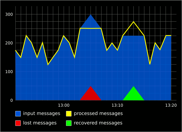
The input/output graph model is used to represent the relationship between two sources of data: the beginning of a process and the end of it.
If the process is internal and the processing time is negligible compared to the sampling frequency, then we expect the two curves to match perfectly. Any difference in the curves indicates either that the process hasn’t been completed (negative difference) or the process has completed with some delay (positive differences). These differences can be superimposed in the graph using a red line for negative differences (e.g. losing data) and a green line for positive differences (e.g. recovering data).
 \
\
If a graph is constructed for each input/output metric couple of an entire system, then we have a way to get a pyramidal view with graphs organised hierarchically. From the top level (main view) we should be able to dig in and display progressively more details about a particular execution branch. This is particularly useful to find and isolate the source of an issue.
Combined Graphs
One of the advantages of using a system like Graphite comes from the ability to easily collect and combine graphs from multiple sources, so it is possible to easily detect correlations between multiple events, including network, machine or even social media metrics.
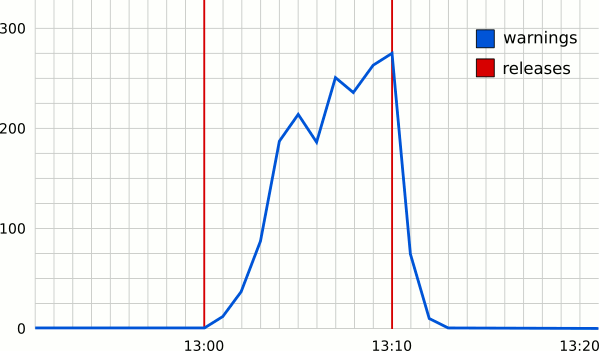
In particular, the release graph, represented using vertical lines that marks the time of releases, can be superimposed onto the application graphs to immediately spot issues or anomalies with a particular release. For example, in the following picture, it should be immediately obvious that something went wrong with one of the releases.

\